
Sonshine Boys
Sonshine Boys is a clothing and community brand for boys whose individuality is the point, and for the families, educators, and advocates who champion them. Founded with neurodivergent children in mind, the brand makes apparel that prioritizes comfort, dignity, and self-expression, paired with messaging that uplifts rather than explains. They came to us needing a brand strategy and visual identity capable of holding all of that at once: a label that's joyful on the surface and deeply intentional underneath.
Client
Sonshine Boys
Scope
Brand Strategy & Identity
Our Strategy
The brand begins with Ylorie’s son. The founder's child spent the first ten months of his life in the NICU, a beginning that reframed what comfort, care, and clothing could mean to a family. Sonshine Boys is the brand that experience built: one designed to meet children where they are, and to make their families feel less alone in the meeting.
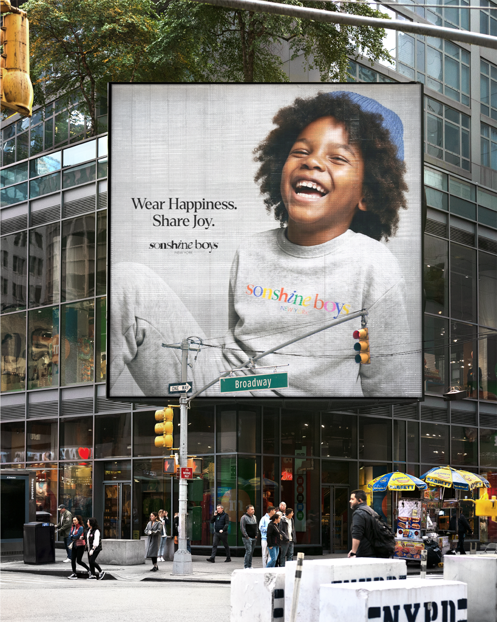
Our strategy translated that origin into a system. We grounded the work in research, listening to parents, educators, and advocacy leaders, and shaped an identity around three commitments: joy as a serious value, comfort as a form of care, and community as the real product. The visual language is warm without being saccharine, confident without being loud. It speaks to children directly, and to the adults who love them with equal weight.
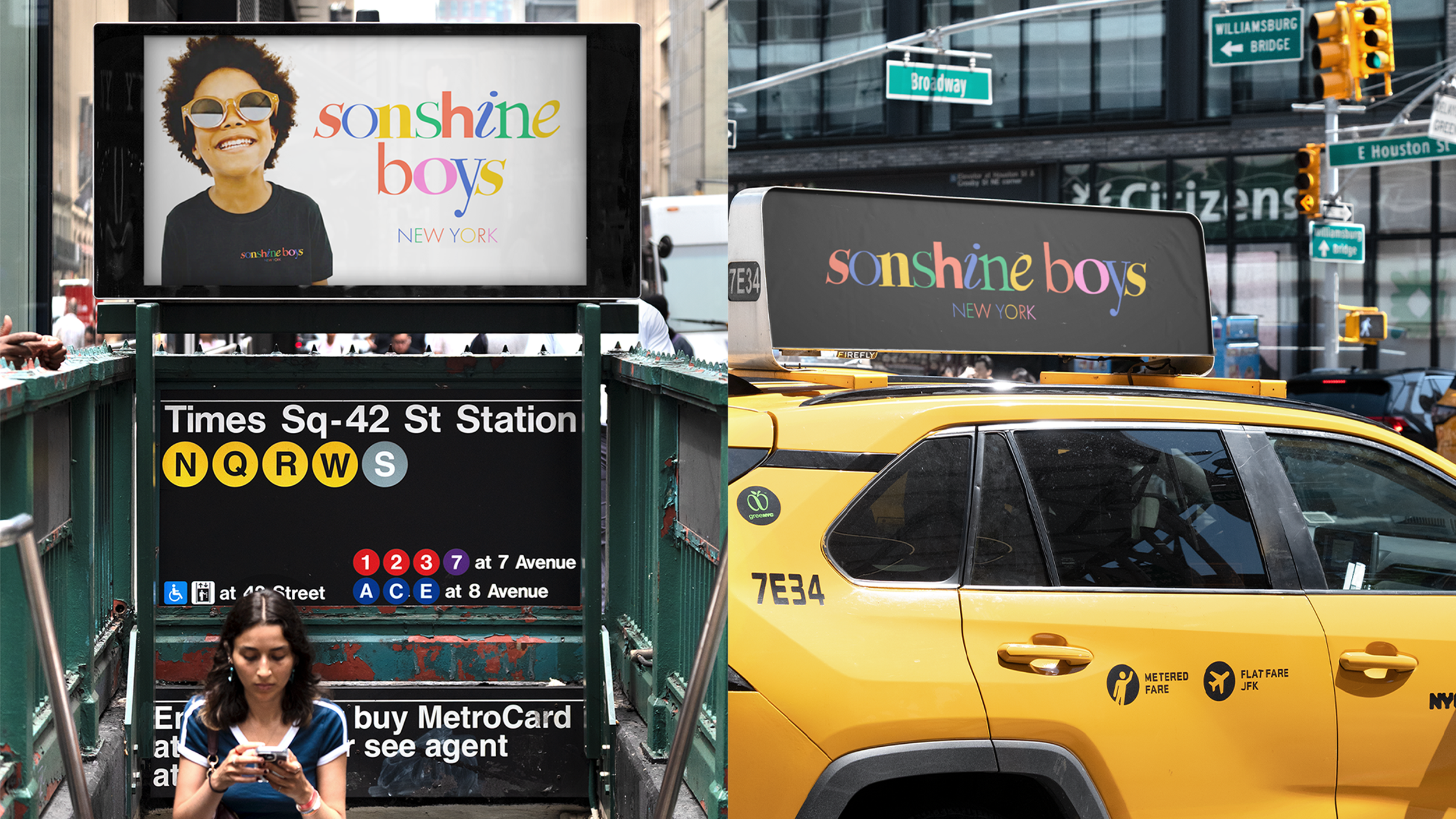
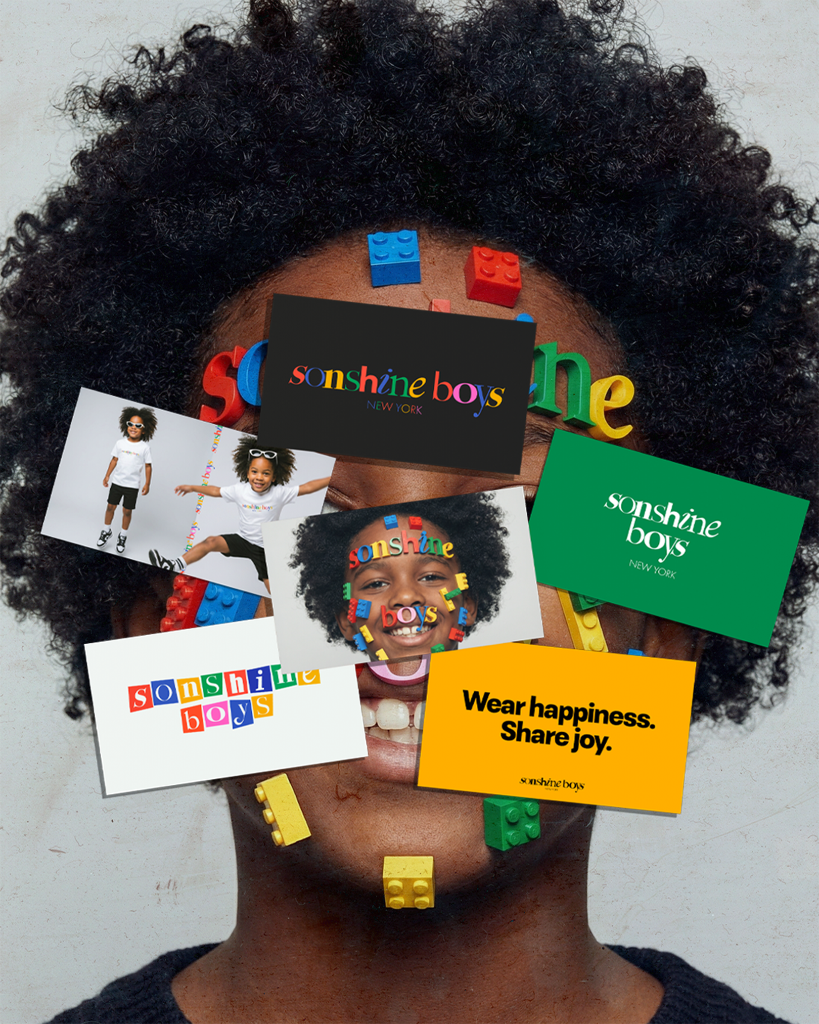
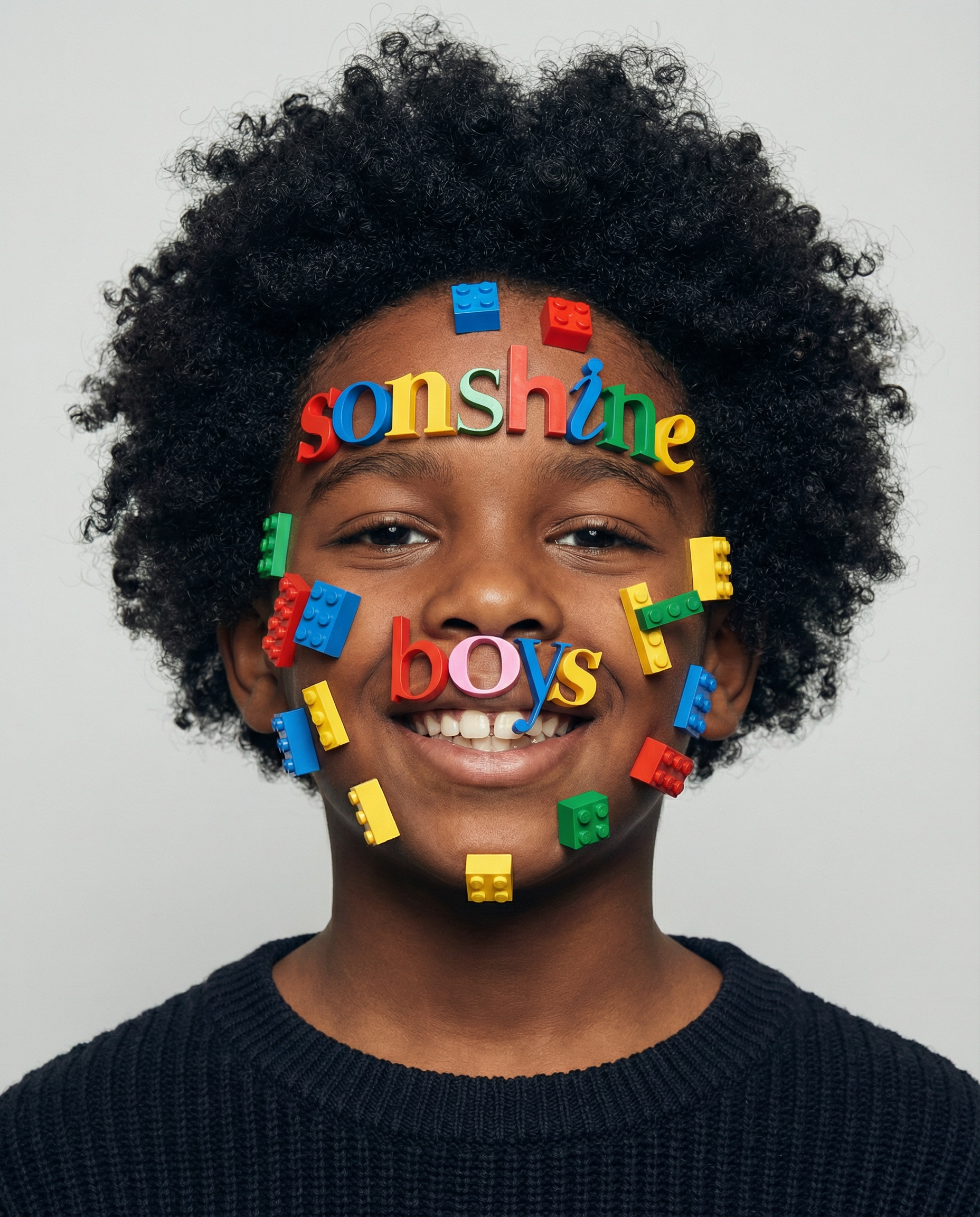
The logo and color palette are inspired from blocks. At first the color palette reads like a child’s first box of crayons, but pitched at a tone that's confident rather than trivial. The reference point is intentional. Like LEGO, the colors function as building blocks: discrete, self-contained, designed to be combined in any order. They are the building blocks of life, and the visual logic of a brand that believes every child is built differently and belongs to the same whole.
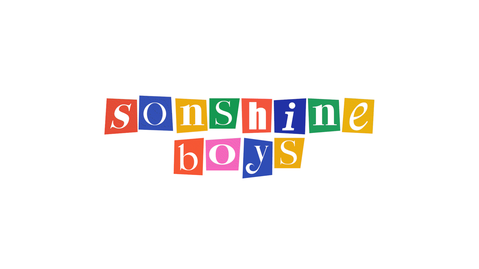
The wordmark is rendered with each letter dressed in a different type syle and color from the palette. Every letter is itself, and every letter belongs to the same word. It is the brand's mission written in type: a community of individuals, unified without being uniform.
The logo lives across a flexible suite. A primary lockup carries the brand in its fullest form. A block variant treats each letter as a colored tile, making the building-block metaphor explicit, useful for product, packaging, and moments that want the brand at its most playful.

WORK WITH US
Our Brandspresso service is designed for businesses seeking a quick and effective foundation for their brand. By focusing on only the essentials, we offer a clear roadmap for your brand's voice and visual identity, ensuring consistency and impact in all your interactions. As part of your purchase, you'll receive a handy physical flash drive or SD card loaded with all your essential branding elements, providing effortless and immediate access to your brand's core assets.